
Photo by Monstera on Pexels.
Why we send our sensors to be calibrated
All of us who work in museums or heritage and run environmental monitoring programmes know the answer to this.
It's pretty basic. If your datalogger sensors are not working properly, they could really affect your decision-making process for those areas where you keep important, sensitive objects.
So we know it's important to have the sensors working properly.
The thing is, I only recently discovered that the extent of my knowledge on this was limiting the results I was getting. The following is information that lab analysts and engineers may consider very common and obvious, but it's something that I had never seen before and was certainly not included in my (otherwise excellent) training in conservation. Are you in the same boat?
What I was told:
Just send your loggers off to calibration service every now and then to fix them up.
That sounded straightforward enough. However, here are the things I didn't know and nobody ever told me...
- Time in between calibrations should not necessarily be standard. Just because you're used to sending your loggers of every 'x' years, doesn't mean that's the correct time for your loggers.
- If you're not applying the results that come back in the calibration report, there's a chance you might as well not have done anything.
- For the most important bit, I will let Wikipedia give you the following because it's the clearest way of saying it:
In measurement technology and metrology, calibration is the comparison of measurement values delivered by a device under test with those of a calibration standard of known accuracy. Strictly speaking, the term "calibration" means just the act of comparison and does not include any subsequent adjustment.
Did you know that when you send your sensors off to a "calibration" service, that does not necessarily mean they're fixing them? I certainly didn't!
First important conclusion: Make sure you know what service you are requesting and whether your service includes actual sensor adjustment. If your service does not include adjustment, then I'm afraid you can't just put your reports away and forget about it. Turns out I had sorely misunderstood the meaning of the technical term "calibration". What about you?
In this post, I will only talk about temperature and humidity for the sake of brevity and simplicity, but you can probably extrapolate the information to all other sensors. Please note that the following is normally applied to laboratory or commercial or auditing analytical equipment that requires high accuracy for various commercial and legal reasons. If you're just monitoring environments, you will have a bit more leeway regarding acceptable errors in your numbers.
What information do calibration certificates give you?
First of all, if you are in charge of getting these services, remember that it should be conducted by a provider accredited under the ISO/IEC Standard 17025.
There are a number of different types of information which your calibration certificate should contain. If you want to look at those details, check out this page by the Omega company in the United States.
Ok, I sent it off and the numbers look small, so it's... fine? Can I put it away and forget about it?
I certainly did for a while! But the answer is maybe. Let's do a mini-checklist.
- My service included adjustment. ---> Brilliant, you can put it away, but you should still look. If the numbers were big, you will want to keep an eye on it over time.
- My service did not include adjustment ---> Do not just put it away without looking. You will need to adjust your results.
Sigh. What am I supposed to be looking for?
1. The errors of your sensors
It is normal to do 3-point calibrations for three different temperatures and three different humidities. They will show a positive or negative number based on how they differ from the standard used.
If your sensors have not been adjusted in the service, you will have to add or subtract these numbers from all your readings in order to get the accurate measurements. This will be important if you have very sensitive spaces and/or if the numbers obtained will make a significant difference in your readings.
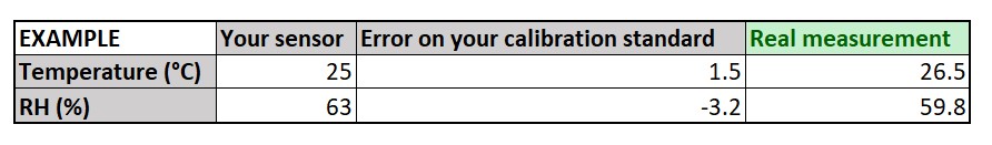
Adjusting readings with calibration information.
2. The deviation of the measurements
These will also affect the accuracy of your measurements. The number provided alone might be within your acceptable ranges, but it might push you out of them if you take the deviations into account. The following is a table with arbitrary numbers just to show you a visual example of how deviations can mess with your data.
I have coloured the dots blue where all is in order, red where they are out of range, and orange where they are within range on their own but out of range if the deviation is considered.
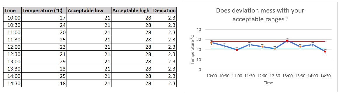
Deviations may be enough to cause doubt about whether your numbers are within range or not. If you were to look at these numbers without deviations, you'd be within range 70% of the time (7 out of 10 measurements). With deviations, this changes to 30% ok with 40% being potentially not, and 30% out of range. Not quite the same, is it!
3. The period of use for your results
Your results will be applicable until the next time you run the calibration. This time can vary between a number of months or a few (1-3) years. This means that you will need to apply the adjustments in your calibration certificate until the next time you run the service.
I get it. I probably should look at these things. What else am I missing?
Remember I mentioned that time in between measurements should not necessarily be standard? I will add to this another question. How do you know when it's time to replace your sensors entirely? The answer, as I have come to understand it, is bullseye charts.
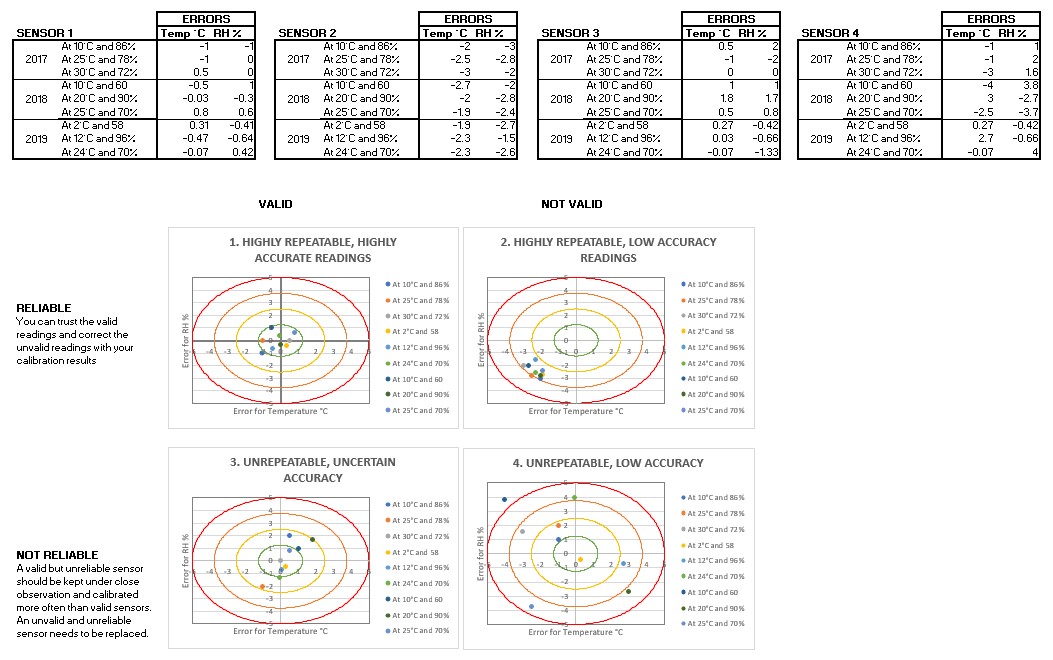
As the name implies, bullseye charts look like... well... bullseyes. These have been made in Excel. As you map your calibration results on, you will start to see where the dots place themselves in the bullseye, and this will help you decide what to do next.
You can make your own decision regarding where to draw the circular lines in your bullseye charts, but I like 5°C and 5% because they are nice, round numbers and 5% humidity is the lowest acceptable variation within a day as presented in this paper by Boris Pretzel.
You are welcome to download my Excel template here. Keep in mind that the circles have already been drawn for you in the BullseyeCircles tab and that you should only mess with it if you want to change their sizes.
How to add info to the bullseye charts
I think the image above and Excel provided are pretty clear, and I'm sure you can reverse engineer the information based on the provided Excel, but here are a couple pointers:
- Make a row for every calibration point run. In these made-up examples, the four sensors shown have been run through three points for three consecutive years. The points used will depend on the standards used by the service provider you hire. You can ask them what they are, and they might even tell you what points they have so you can choose which ones you want. Try to pick some that your logger normally encounters when in service.
- Make a bullseye chart per sensor over the years or over the calibration services. Don't put different sensors on the same graph.
- You can keep adding information to the tables below if you have more results and just add the selected cells necessary to the graphs as you go.
How to interpret the bullseye charts
As shown in the image above, there are four potential results. You should be looking for reliability. Here is a brief breakdown of the four types shown above:
- Valid and reliable (top left): Results are great. Your sensors are working well and giving accurate results. You can trust them. You can check how often they get sent out for calibration and if the results keep coming back the same, you can lengthen the time in-between services.
- Not valid but reliable (top right): Results are fine. Your sensors are working well, but they're a bit off. This can easily be corrected by applying the error adjustments given by your calibration certificate. This will bring the results back into the middle for valid results.
- Valid but unreliable (bottom left): Your sensors seem okay, but the dots are a little too spread out for comfort. Consider reducing the in-between time for calibration services and maybe find a service that includes adjustments if you haven't already.
- Not valid and not reliable (bottom right): Your sensors are all over the place and should not be trusted. Check with a provider if they can be adjusted at all or just consider replacing them altogether.
Benefits of knowing all this stuff
Yes, it's not all just hassle - although I will admit it feels like a big hassle.
Guess what? If you're low on budget, running these graphs might help you reduce the number of calibration services you do. If you notice that, over time, your sensors are just fine, then maybe you don't need to run the service as often as you thought. On the contrary, if you notice your sensors are all over the place, maybe you should get new sensors instead of using up your precious budget on calibrating equipment that should be let go.
If you liked this post, you can follow me on Twitter where I'll be posting more content on conservation tidbits and how to improve your collections at home.