Contents
- Why is this post about pivot tables?
- Where to find pivot tables
- What are pivot tables anyway?
- How to make a basic pivot table
- How to use pivot tables for Integrated Pest Management
- How to use pivot tables for manual environmental monitoring
- How to use pivot tables for small-scale collections management
- General recommendations
- Other uses for pivot tables
Why is this post about pivot tables?
Sometimes, you don't have any budget for nice collections management software of any kind. Or maybe you're just a volunteer, or for whatever reason, nice, paid software isn't an option.
In these cases, you have to make the best of what you have - and you should know that what you do have actually has the possibility of being more powerful than you thought.
For this reason, I am writing this post about pivot tables. You may or may not have heard of them before. If you have, you're probably using them already and love them. If you haven't, I envy you the moment of discovering them for the first time because, I kid you not pivot tables can be a total game-changer if you do preventive conservation or any kind of collections management without the benefit of dedicated software. Without further ado, let's get going.
Where to find pivot tables
Let's start with finding out where pivot tables live:
It is possible to work with pivot tables on both Excel and Google Sheets. The following two screenshots show you where they are.
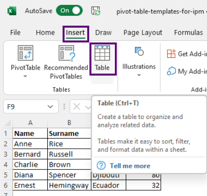
Excel
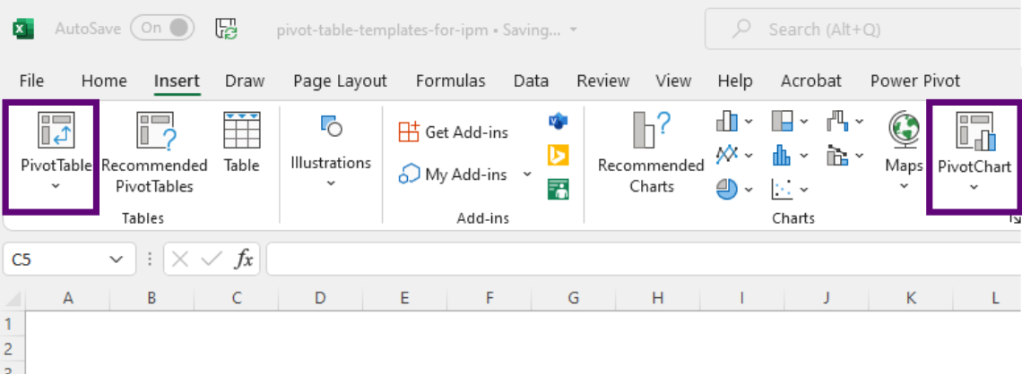
Location of pivot tables and charts in Excel under the Insert tab. I have also pointed out that there are pivot charts in Excel, which are charts that are based on pivot tables and are therefore responsive to pivot table changes.
Google sheets
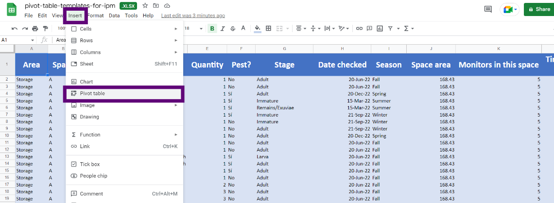
Location of pivot tables in Google Sheets under the Insert tab.
What are pivot tables anyway?
According to Microsoft, "A PivotTable is a powerful tool to calculate, summarize, and analyze data that lets you see comparisons, patterns, and trends in your data."
When I first came across this idea, I didn't understand the point - isn't this what Excel does already? Well, in a way, yes. But also no.
Pivot tables allow you to take a general table full of unorganised data and automatically summarise or filter it in order to make comparisons that are more useful to you than a huge table of information. Don't worry if this still doesn't make sense, we will get there.
One of the cool thing about pivot tables is that you don't have to worry abour organising your information from the beginning. All you have to do is make sure you have a column for every possible type of information or filter which you will be needing to analyse your data and then just start populating the information. Pivot tables will then do all the organising, summarising and filtering for you.
If you look for how to use pivot tables on YouTube, most of the (really good) examples have to do with sales or profits, so I thought I'd write this post to show you how pivot tables can be used for conservation and collections management.
If you still want to check out those videos, here are a couple links that helped me get my brain around the possibilities of pivot tables:
How to make a basic pivot table
1. Make a table
I've been an Excel user since I was taught to use it in school, some 20 years ago. And it turns out I've been using tables all wrong for 20 years.
I don't know if you knew this, but it has come to my attention that just putting data into the Excel grid and formatting it with nice lines into something that looks like a table does not, in fact, make it a table.
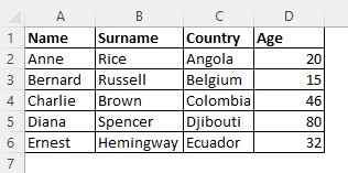
Ceci n'est pas une table. It looks like a table, but officially, it is not.
To make a real table, you have to select your not-table and either press the Table button under the Insert tab in Excel, or you can hit Ctrl+T.
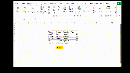
Watch this quick GIF on how to make your not-table into a real table. Note that this is not necessary in Google Sheets.
Notice that your real table now looks different. The header has changed colours (in my case it becomes shaded in blues), it automatically shows you filter arrows next to each column, and if you happen to scroll down a lot, you will notice that your header row becomes grey and replaces the A,B,C... names of the columns so that no matter how far you scroll down, you will always be able to see the title of your headers. You are now ready to make pivot table.
Make pivot tables from your basic table
Excel
Now that you have a basic pivot table, all you need to do is select it and click to create a pivot table. In both Google Sheets and Excel, you will find this button under the Insert tab. See the section at the top of this article to find the screenshots.
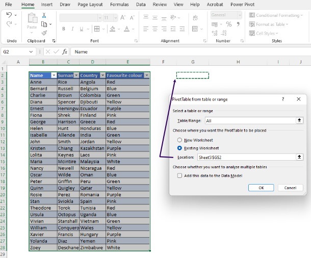
Choose the base table by either selecting the data or typing in the name of your table. Then choose the location for where your new pivot table will show up. In this example, I have chosen a cell (G2) next to the original table.
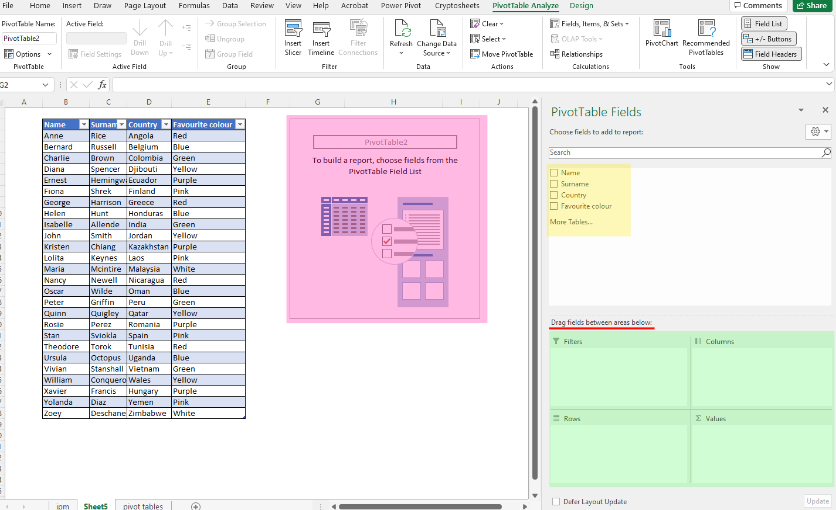
Once you have created your pivot table, two intimidating looking things will appear. One is a strange box with the name of your pivot table (pink) and instructions. The other is a right side menu bar. At the top (yellow), you will see a list of all the columns in your original table. Below that (green), you will see four boxes called Filters, Columns, Rows and Values. Don't be afraid, watch the video below for how to use them.
As you drag fields from the yellow section to the green sections, your pivot table will automatically appear, pulling data from your original table. Note that in the Values box, you can change whether you want the number to be a count, a sum, an average, or many other types of numbers.
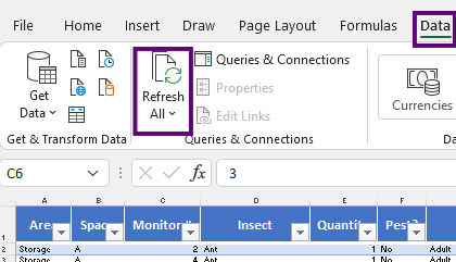
Important note: Google sheets will automatically update pivot tables as you add information to the base table. However, Excel will require you to fo to the Data tab and press the Refresh all button to update the information.
Google Sheets
Creating a pivot table in Google Sheets works exactly the same as in Excel with the exception that you do not need to "create" a table. You can just select the table you have and create the pivot table from there.
As you will see in the very short video below, the main difference between the Excel and Google Sheets interface is that Excel shows you four squares to drag fields into while Google Sheets gives you a column with subtitles to drag into.
How to use pivot tables for Integrated Pest Management
Now that you have seen the basics of how pivot tables work for random data, let's use it for Integrated Pest Management.
Here is a fake table of Integrated Pest Management information you can download from Google Sheets to play with.
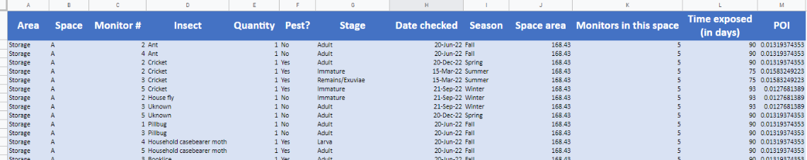
Basic table for IPM tracking in Google Sheets. These are the columns that I have created which help me use this table as the main database for a made-up IPM tracking exercise. Note that the Pest Occurrence Index (POI) column is a calculated number based on Baars & Henderson.
Watch this video on how to create a pivot table from the base table on Google Sheets. The process will be exactly the same in Excel with the exception that for Excel you first need to turn your not-table into a table using Ctrl+T. In both cases, you are just dragging and dropping fields into the right places.
If you use Excel for your pivot charts (and I strongly recommend it over Google Sheets), you will be able to create all kinds of charts and graphs to illustrate your IPM results. Go ahead and check out the fake table of Integrated Pest Management information where I have even left you some example charts you can make.
How to use pivot tables for manual environmental monitoring
Pivot tables will also help you manage environmental monitoring data if you regularly go around with a manual hygrometer. Yes, we know this is a bore, but hey, for some of us, that's all we've got.
For this, I have made you this fake table of environmental monitoring information you can download from Google Sheets to play with.
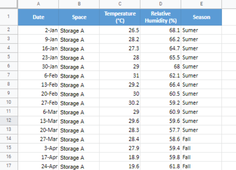
Notice that just inputting the information of the manual readings you take each day will be enough to give you a table which you can use to create pivot tables specific by spaces, seasons, and any other filters you may decide to use. All you have to do is put the information you will want to filter by as a column in your base table.
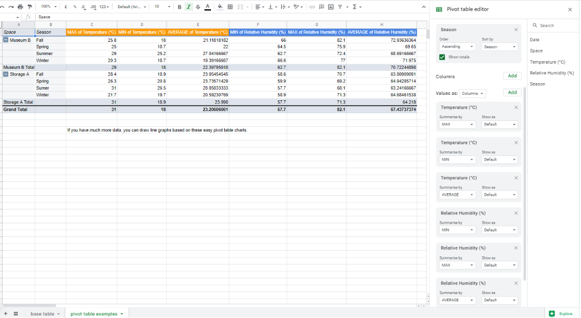
This pivot table was easily made by dragging the temperature and relative humidity readings into the Values field, using the Spaces and Seasons as rows. Make sure you check out the Google Sheet with environmental monitoring information to see it in detail.
How to use pivot tables for small-scale collections management
By now, you're probably getting the hang of pivot tables. Check this out. Yet another use for pivot tables is to help you sort your collections. Naturally, this is only the case for those of us who do not have a bespoke software for collections management or who are just managing small collections - even your own books at home or any personal collections will benefit greatly!
I have made you this fake table of object movement information you can download from Google Sheets to play with.
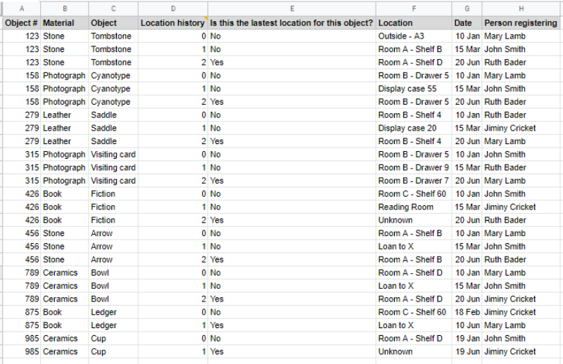
This fake table of imaginary objects in a collection shows some basic ID information for each object plus a location history and a yes/no column to indicate whether the location is the most updated one.
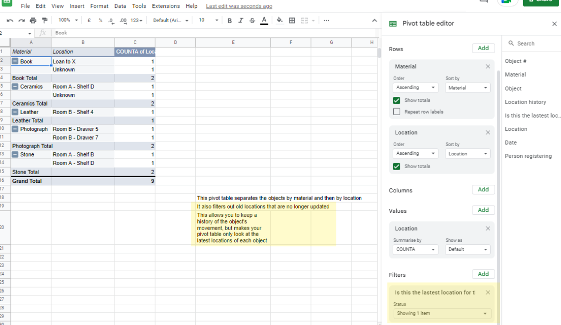
Look at the yellow sections. This particular pivot table allows you to filter out the latest location for an object while allowing the original table to maintain information on object history. Additionally, note that it is possible to identify objects with unknown locations. If you so wished, you could play with the filters available to find objects on loan, or even which objects move around the most.
General recommendations
In general, if you intend to use pivot tables to their fullest, I strongly recommend that you stick to Excel. Google Sheets is very finicky when you start creating cool charts - in short, it's a bit of a nightmare.
For this reason, I only recommend Google Sheets for pivot tables if you want something that is on the Cloud and can be easily shared among a lot of users. It is also fine if you will only be creating pivot tables and not pivot charts. I do not recommend it for intense data analysis or for data visualisation.
Remember that all you need is a base table with all the important information. Once you have that, the world is your oyster. You can make as many pivot tables as you want to show as many things as you require. All you need to do is put them on different tabs and let them pull the information for you from the main table.
When you are first starting out, I recommend just playing around and moving fields around to the Rows, Columns, Values and Filters boxes to see what they can give you. Then push the Make a Chart or Pivot Chart button and see what that gives you. You'll be amazed at the results.
Other uses for pivot tables
Initially, I used to find pivot tables a bit intimidating. I had seen them on Excel but had no idea what they did,and that big fields box that showed up when I clicked "insert pivot table" looked hella scary.
However, since I learned to use pivot tables, I've gone absolutely crazy over them. I now use them at work for collections-related issues such as following up on object locations, Integrated Pest Management interpretation, manual environmental monitoring and even collection surveys. The time saving introduced by this kind of basic automation is absolutely amazing.
I imagine that now you may feel more comfortable with pivot tables, you can think of a million ways they could be useful for you. Maybe for facilities stuff, or any other thing you need to keep track of! In my personal life, I have even introduced them into my personal finances and, believe me, they have made my life so much easier.
Let me know if this blog post helped you out and if you are also a pivot table fan like me! Please share any other amazing uses for pivot tables you may have found for collections care.
If you liked this post, you can follow me on Twitter where I'll be posting more content on how to make it easier to manage collections with few resources and free tools.